How Do You Help People Find Their Way—Fast?
320 Bay Street, Toronto
Lead Product Designer
Large-format digital signage (lobby)
1 Designer, 2 Engineers
8 weeks - shipped
Scroll to explore
Designing a First Impression for a Historic Landmark
Located in the heart of Toronto’s financial district, The Permanent is a historic office building serving a high volume of daily visitors and professionals. The challenge was to design a digital directory that simplifies wayfinding, surfaces essential building information, and supports fast, confident decision-making—without compromising the building’s architectural and historical character.
How can a digital directory honor history and reduce confusion?
The Permanent’s lobby needed a digital directory that supports fast, confident navigation for visitors, while respecting the building’s historic character and high-traffic environment.
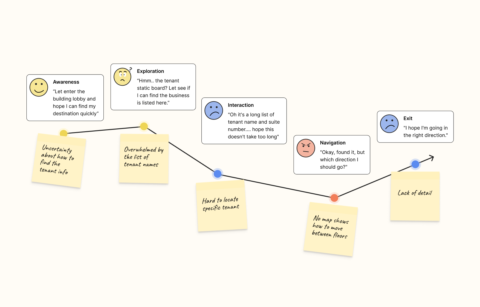
Visitors struggle to find their way in The Permanent’s busy lobby, leading to frustration and delays. The existing static signage is outdated, hard to read, and fails to provide real-time information.
1. Limited screen space: prioritize essential info without clutter 2.Users: Diverse user groups, disability, first-time visitors, tenants, and delivery personnel. 3. Complex environment: PATH connections, transit, and lobby layout 4. Historic context: design must honor Art Deco architecture and heritage status.
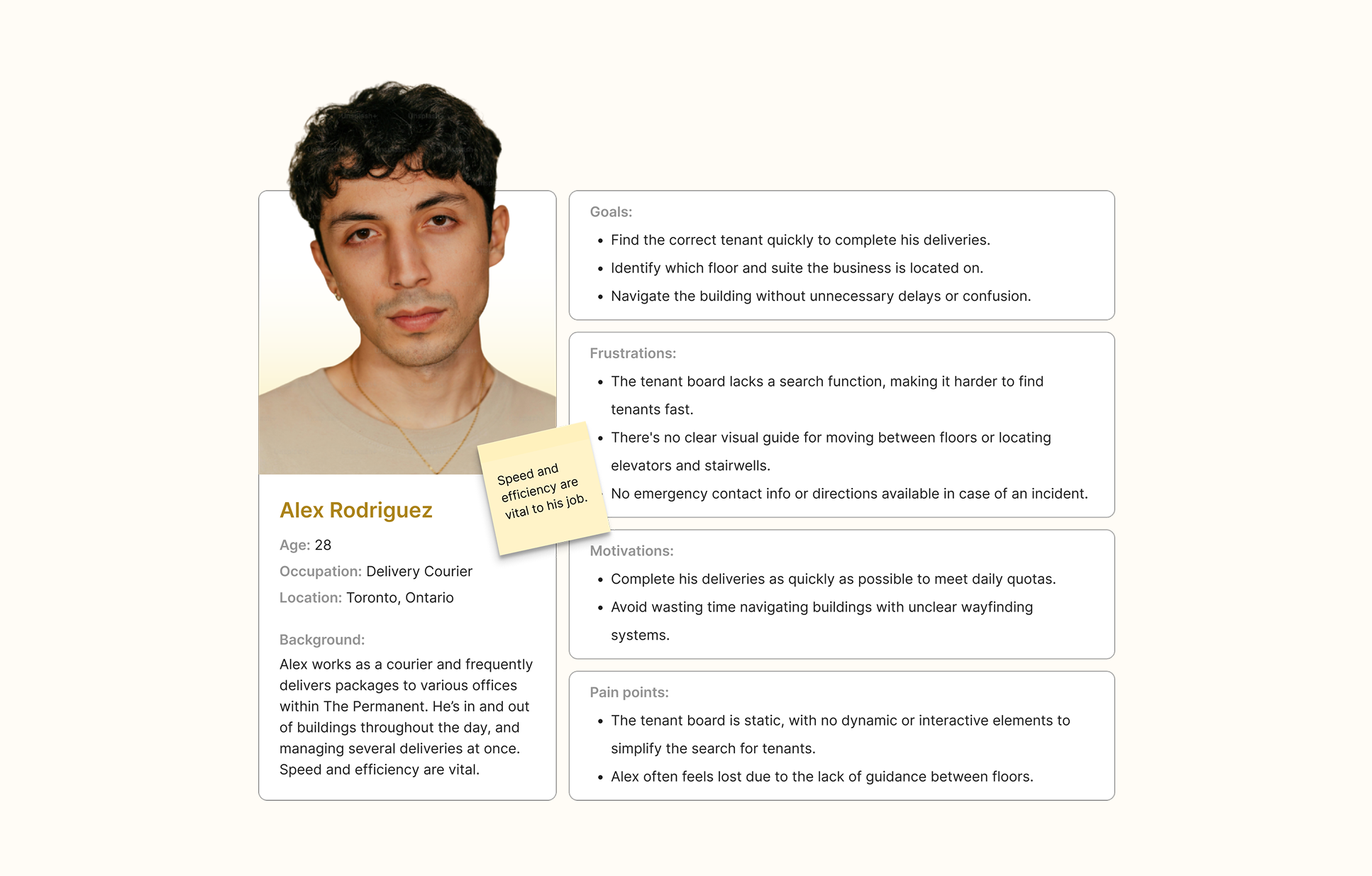
Combined qualitative research with real-world observations and UX insights.
Conducted interviews with building visitors, reception, and security staff to learn how people currently navigate The Permanent. These conversations revealed that a majority of visitors struggled to find tenants independently and often relied on staff for directions.
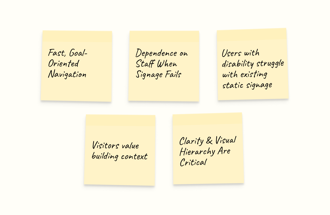
most people gravitated toward a tenant search feature first, indicating the importance of searchable wayfinding.
Focused on users with mobility challenges (e.g., wheelchair users) to evaluate existing physical signage. Observations showed traditional signage often lacks accessible interaction design and clear positioning, reinforcing the need for inclusive digital controls.
1. Users want quick access to tenant info and building amenities. 2. Clear visual hierarchy is essential for scanning information quickly. 3. Accessibility features are necessary for inclusive navigation across diverse users.
After research and observations, several clear patterns and themes emerged from user behavior and environmental context.
How Might We...
How might we help visitors find their destination within seconds of entering the lobby?
How might we reduce reliance on reception and security for basic wayfinding?
How might we design an accessible experience for users with mobility challenges and diverse needs?
How might we present essential information clearly without overwhelming busy professionals?
Sketching a Clear Path Forward
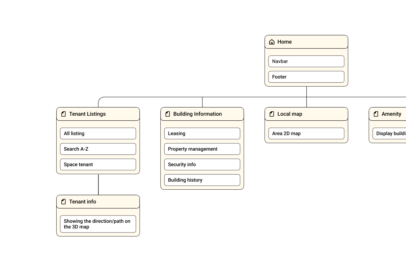
Mapped out key content areas based on user needs: tenant directory, building information, local map, amenities, and transit updates. Prioritized tenant search as the primary entry point.
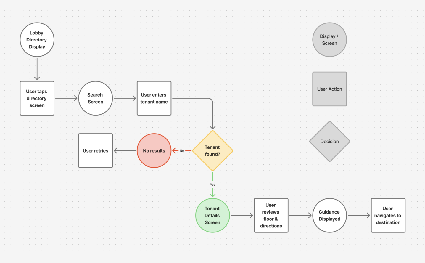
Created user flows for common scenarios such as finding a tenant, locating amenities, and checking transit info. Focused on minimizing steps and cognitive load.
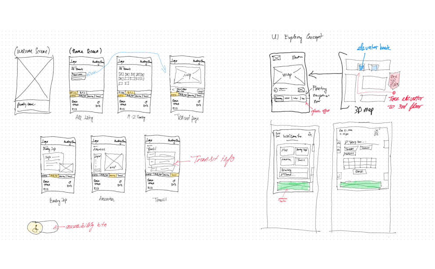
Sketched multiple layout concepts to test hierarchy and interactions, gathered early feedback, and iterated toward clearer, more usable designs aligned with the building’s character.
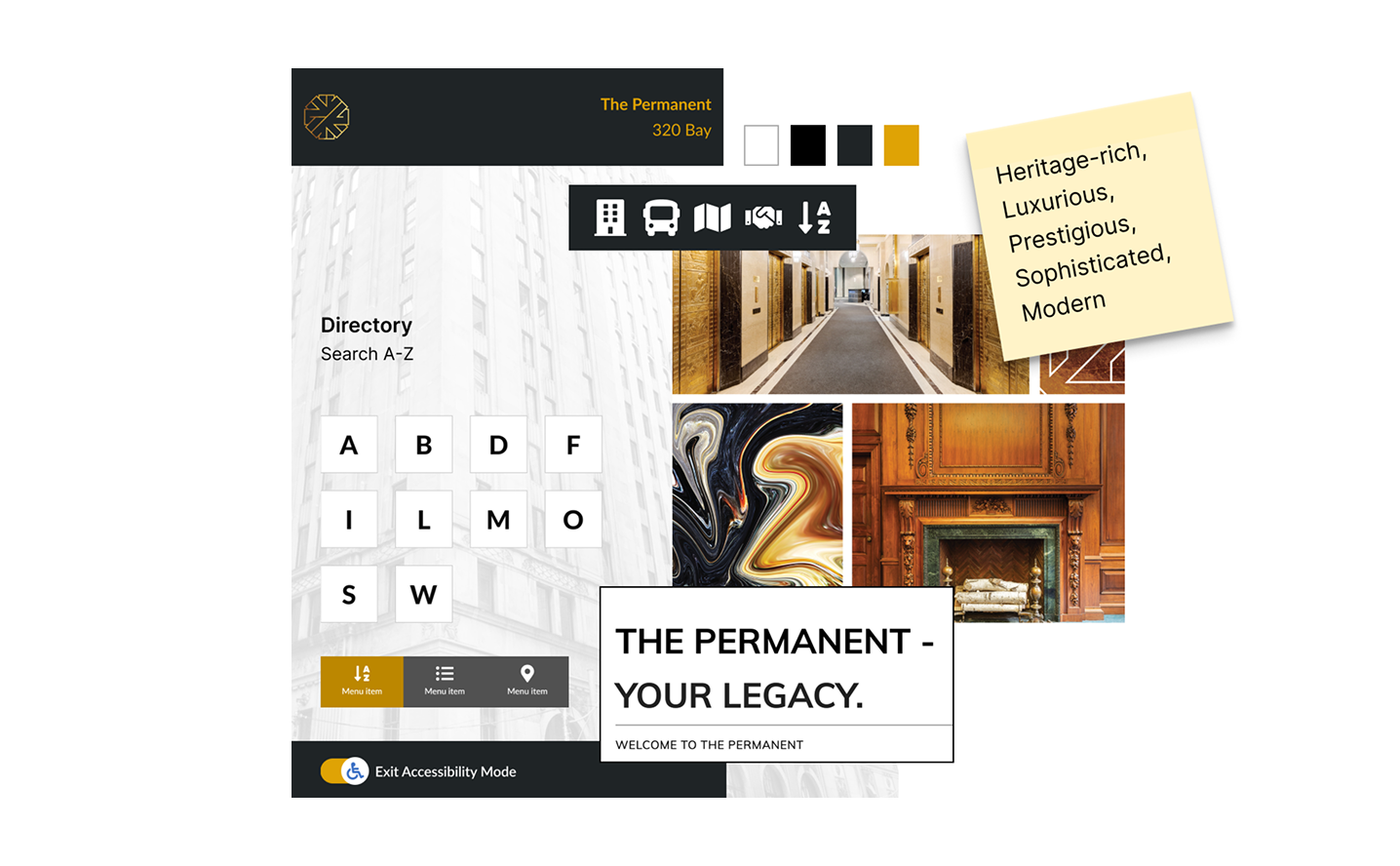
Moodboard to share my design vision for the interactive signage, blending a clean, modern style with elements that honor the building's historic charm and downtown Toronto's professional atmosphere.
The final design focuses on speed, clarity, and contextual awareness
I focus on connecting early research insights with visual design choices to create a cohesive user experience. Building on the initial wireframes, I refine the visuals and interactions to make the directory both functional and visually appealing.
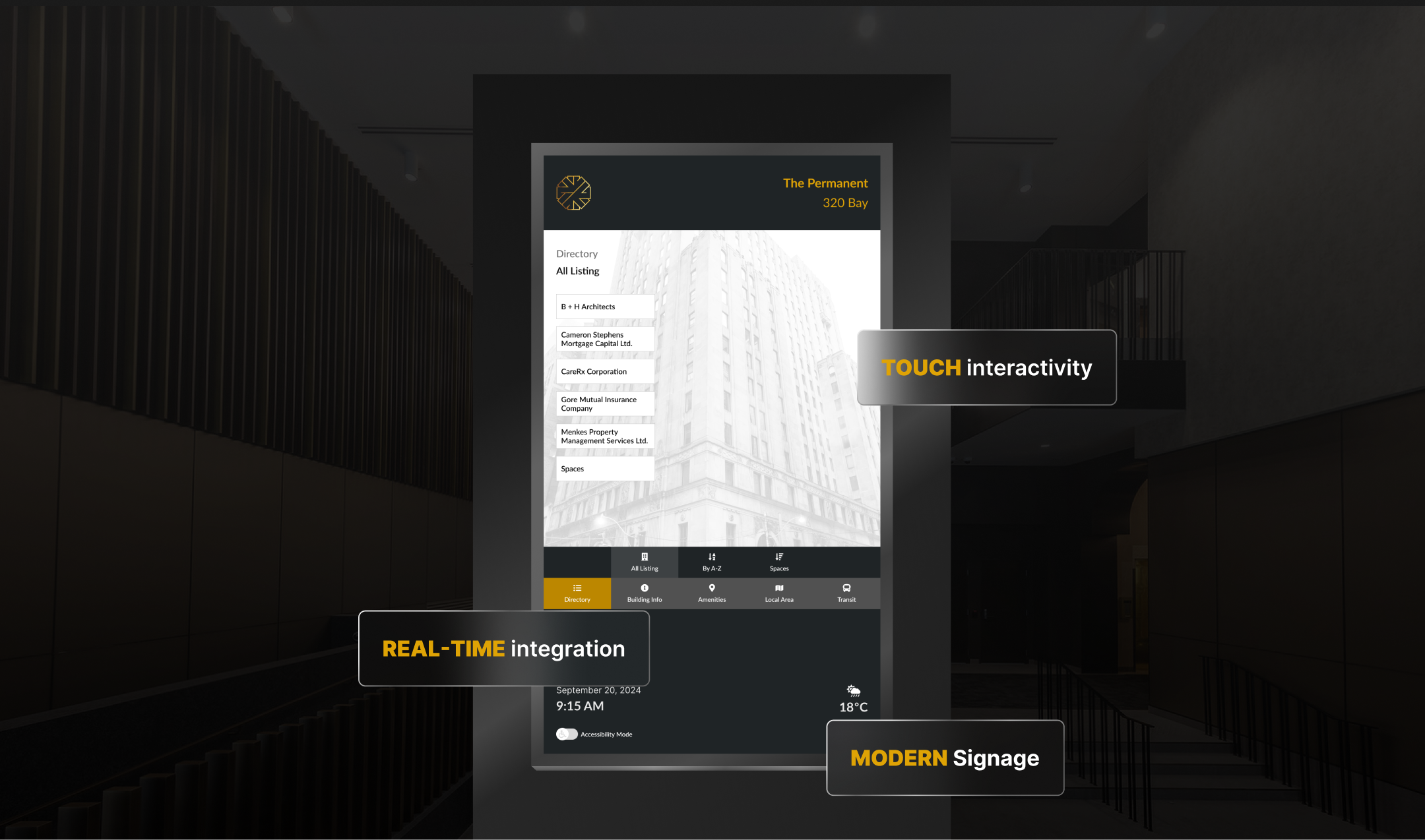
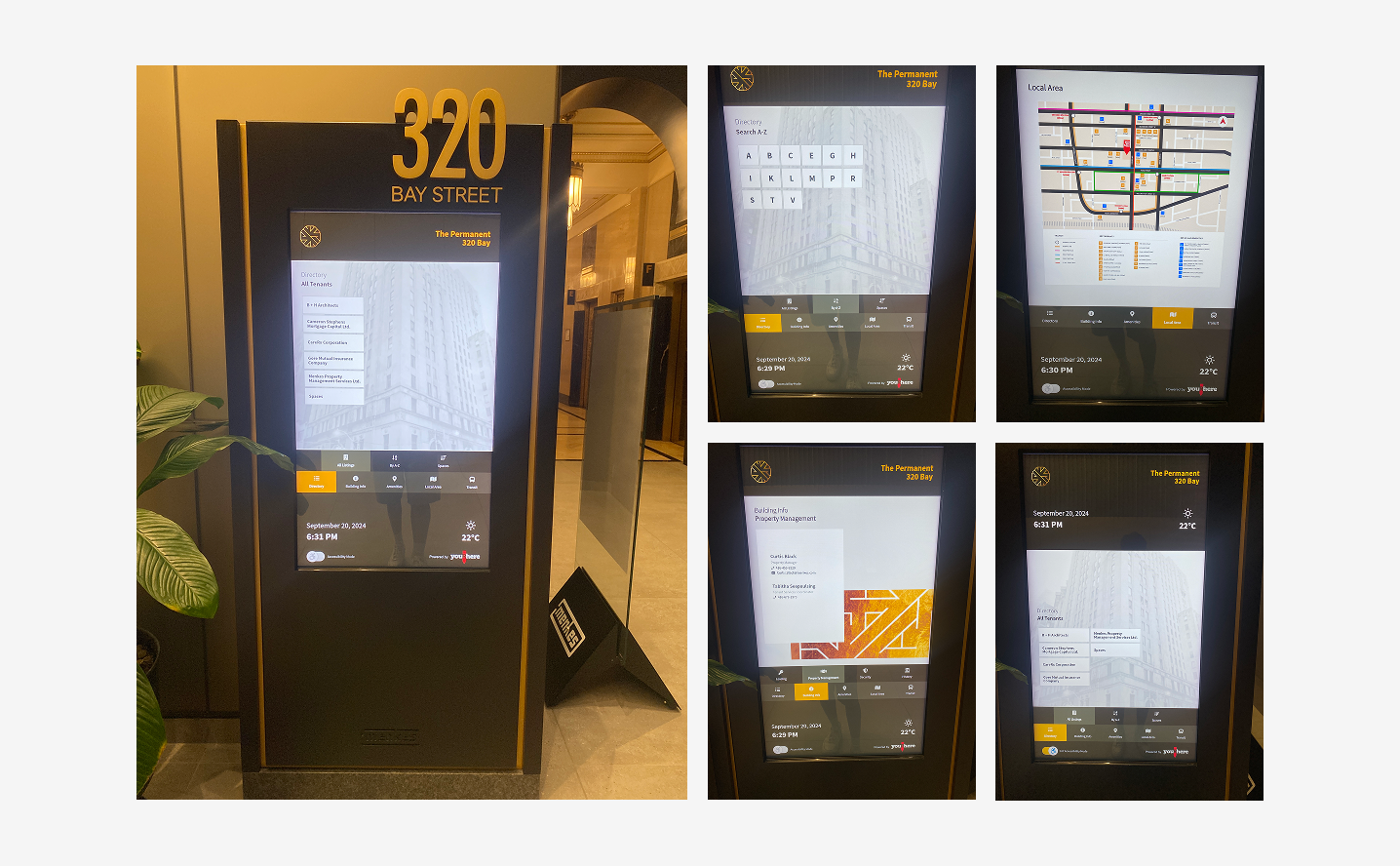
Flexible Tenant Search for Faster Discovery
To help visitors quickly find tenants, I designed multiple search paths—All Listings, A–Z Search, and Floor View—so users can choose the method that best matches their mental model. To avoid overwhelming users, options are intentionally limited, applying Hick’s Law to reduce decision time. The Tenant Directory Search is positioned as the primary entry point, ensuring fast and intuitive access to tenant information.
Clear Wayfinding Through 3D Mapping and Guided Paths
I created a 3D building map in 3ds Max, based on the architectural floor plans, to make navigation more spatially intuitive. The 3D view helps users better understand scale, orientation, and destination context compared to flat maps. A “You Are Here” indicator anchors users in the space, while animated vector paths visually guide them step by step to their destination, reducing confusion and cognitive load during navigation.
Structured Building Information to Build Trust
Building details—leasing, property management, security, and building history—are organized into a clear information hierarchy, allowing visitors to quickly scan and access what they need. Design elements inspired by the building’s architecture reinforce brand consistency, creating a professional, cohesive, and premium experience that builds trust with visitors and prospective tenants.
Local Area & Transit Integration for a Complete Visit Experience
To extend usability beyond the building, I designed a Local Area section featuring a simplified 2D vector map that highlights nearby restaurants, shops, and amenities. The Transit section provides real-time TTC updates with a clean, high-contrast layout optimized for quick scanning, enabling visitors to confidently plan their next steps once they leave the building.
Accessibility-First Design for Inclusive Navigation
To ensure the directory is usable by all visitors, I incorporated accessibility features such as high-contrast text, large touch targets, and screen reader compatibility. The interface is designed to accommodate users with mobility challenges, ensuring that everyone can navigate the building with ease and confidence.
The interactive wayfinding directory is now live at 320 Bay Street.
The new digital signage has significantly improved the visitor experience, reducing wayfinding questions for staff and allowing reception and security to focus on higher-value tasks. Visitors report greater confidence navigating the lobby, with an interface that feels intuitive while respecting the building’s historic character.
Designing for Real-World Impact
This project reinforced the importance of grounding design decisions in user research and real-world observations.
I was able to create a solution that not only meets user needs but also respects the unique context of a historic building.
The experience highlighted the value of iterative design and user feedback in crafting effective digital experiences.
Read more